COLORATION FOR AUTHORS

EFFECTIVELY USING COLOR

What visions dance in your dreams?

A shorter version of this blog was originally published on the Hometown Authors website on November 5th, 2019…

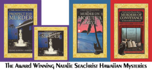
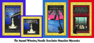
An artist’s sense of color is normally reflected in their creations, so today’s discussion may be most appropriate to authors, especially those launching their first book or moving into a new series, genre, or nom de plume which may produce new design dilemmas. Even if you are an author under contract to a publisher who controls the art for your books, you may be able to offer input regarding the ambiance you wish to see projected. Therefore, I suggest you contemplate artistic issues like color in advance of signing with a publisher. In fact, you may find that analyzing their artistic taste will help you select an appropriate publisher. I’m fortunate to have had the liberty of working regularly with an artist of my choice [Yasamine June] to develop the rich covers of the Natalie Seachrist Hawaiian Mysteries.
As a writer and design consultant, I often focus on color. One of my favorite questions for clients seeking branding advice is, “Have you had your color today?” On the surface, this seems like a simple question, perhaps referencing a bright scarf or sales banner. However, my question is directed at the person’s preferences in coloration.

If you are an author, the question addresses your approach to color in both the art and science of your writing…and how you are envisioning the images that may accompany your text. If your writing reflects your personal voice and style, choosing artistic elements may be straightforward. If not, research can ensure colors appropriate to your genre and writer’s voice. [For technical information on coloration such as color theory, colorimetry, tetrachromats, etc., visit Rainbows of Color.

COLOR SAMPLES
Please note that despite how I’ve planned for these samples to appear, your hardware/software will alter the experience…


FANTASIAS OF COLOR
To help you consider more than your personal preferences in color, let’s explore classical and traditional interpretations of basic colors and shades. In my latest Hawaiian mystery, Murders of Conveyance, the cover features my usual frame with the carved gold of Hawaiian heirloom jewelry and the classic red of ancient and modern China.

RedThis color is traditionally linked to sunsets, fire, blood, Mars the planet and Mars the Roman god of war. Red is now often associated with signature holidays like New Year’s, Christmas, and St. Valentine’s Day, as well as certain nations like China. This vibrant color calls attention to anything depicted in it. Philosophically, it has been associated with licentiousness and the concept of Satan.

Yellow and OrangeAssociated with the sun and gold, these happy and bright colors are used for many attention-getting purposes. Depending on their tone, they may announce deeply discounted items, or conversely, the richest and most valued products.

GreenRepresentative of nature, green is often used for health and environmental topics, products, and services. Green colors are also used for military uniforms and equipment.

BlueIn daily conversation, blue ideally speaks of clear and serene waters and skies. In many philosophical traditions, it has been associated with purity and loyalty. Today, the color is often utilized by financial and insurance institutions wanting to declare their honesty, and by healthcare providers wishing to project their dedication to the well-being of their patients and clients.

Violet and PurpleAlthough these colors are not adjacent on the color wheel, humans perceive them as related to one another. Located at the end of the visible spectrum of light [literally next to ultraviolet], violet is a spectral color that is less saturated [intense] and displays more blue. Purple is more saturated [intense, pure] and balances two spectral colors, red and blue. With both colors perceived as blends of blue and red, these rich colors remain linked to ancient concepts of royalty, power, and wealth.

WhiteWhite is an achromatic color [without hue], embodying all wavelengths of visible light. It is historically linked to purity, cleanliness, goodness, and perfection. Like black, it is a good background for highlighting all colors.

BlackAbsorbing all colors of light, this achromatic color [without hue], is the absence of all visible light and therefore color. Obtained by the mixing of all primary colors, black is linked to darkness, night and evil in historical religious written materials. It is an excellent background for both vibrant and subtle colors.

White and black are often paired for the expression of opposites, as in good and evil, the white hats of the good cowboys vs. the black hats of rustlers, the white dress of the bride and the black of a widow in mourning.

 Gray Also an achromatic color, gray is created by the mixing of white and black. Being neutral, this color is most often associated with somberness, dullness, boredom, uncertainty, and advanced age.

SELECTING COLOR
Scientifically, colors [hues] are specific wavelengths of visible light. When considering coloration in your writing and for book jackets, one of the first questions you might ask yourself is, “What is my design aesthetic?” Also, “Does the style of my writing reflect my taste in art?” Do you like the detail of classicism or the sharp clean lines of modern art? Do you prefer bright primary colors or muted tones? Like an artist, the author draws on a rich palette of images within their mind’s eye. But to effectively communicate, this must be tempered by the expectations of the readers of the genre in which one works.

~  Lighting. The intensity and type of lighting affects one’s perception of tone [intensity of color] and shade [a mixture of black with color which determines how bright the color is].

~  Layering. The layering of color also affects our view of it. For instance, putting a red color on an ivory background will produce a color that has hints of orange.

~  Tint. The tint of a color is determined by the amount of white it may have, which lightens the color.

~  Region. Through the dialect[s] of your characters, as well as the scenes you describe, your text may indicate colors distinctive to the locale of your work. Within my work, I’ve found the greens of trees and plants growing along the shorelines of the Hawaiian Islands [the setting of the Natalie Seachrist Hawaiian Mysteries] to be lighter than those of the hills of `Ulupalakua, Maui. So, which greens are most appropriate to your project? And what about the clarity and tones of blue in the waters and skies you describe?

~  Perceived Gender. This may sound like a dated, or even prejudiced, approach to design. But examining perceptions of your writer’s voice or protagonist may help define appropriate book jacket colors. Consider the differences between romance novels and police procedurals. In the first example, you may have established an ambience that is classically feminine with soft, gentle, and elegant notes. In the second, you may have described a hard-nosed undercover police officer [male or female] who wears black, employs harsh street slang, and fiercely responds to violence. While black is an excellent background for both genres, the artist’s treatment may vary considerably. The romance book often invites the reader to wonder what lurks behind subtle gradations and soft brush strokes of mystical colors and tones. In contrast, the police procedural usually pairs bold primary colors with dark shading set within sharp modern lines.

Once you’ve completed your research and contemplation of coloration for your project, I suggest you write a paragraph outlining the elements you desire with a sample color palette. With colors identified by number in your art or text software program, this will facilitate communication with publishers and artists [should you decide to self-publish].

I should caution you that identifying the colors you wish to see on a book jacket is no guarantee of how the printed work will arrive at your doorstep. Even two editions of the same book, printed by the same company following the same instructions can yield variations in color because of differences in batches of ink or toner, the moisture content of the paper used, and production executed on innumerable types and conditions of equipment.

Wishing you the best in your creative endeavors,
Jeanne Burrows-Johnson, author, consultant, and motivational speaker

For more ideas to strengthen your Wordpower© and branding, please visit: Imaginings Wordpower and Design Consultation. For an in-depth discussion of the nature of color, go to Wearing Your Brand.

You may also wish to check out: 
Rainbows of Color, May 2015
Harmonizing Branding Elements, August 2016
Book Promotion and Evolving Art, January 2017

To learn more about the award-winning Natalie Seachrist Hawaiian Mysteries, including Murders of Conveyance [Winner, Fiction Adventure-Drama, 2019 New Mexico-Arizona Book Awards] and other projects, please drop in at my author’s website JeanneBurrows-Johnson.com. You’ll even find Island Recipes that might inspire your culinary creativity.

Follow Me:
Amazon, Arizona Authors Association, Apple Books
Audible, Authors Den, Barnes and Noble, Blogarama, Book Bub
Cozy Mysteries-Unlimited, Facebook, Good Reads, Hometown Reads

Book sellers may contact book distributors such as:
Baker & Taylor, Follett, IPG, Ingram, Mackin, Midpoint, TitleWave

BOOK PROMOTION AND EVOLVING ART


THE NEVER ENDING ART & SCIENCE OF WRITING

As I examine the months since the launch of Prospect For Murder [the first book in the Natalie Seachrist Hawaiian mystery series], I realize I have not posted a blog regarding the never-ending art and science of writing for a long time.  I’ve started several, but details of the publishing and promotional processes have interfered with my sharing new author strategiesSince addressing the topic of my artistic vision for the book layout for Prospect For Murder in a previous blog, it has been released in hardcover, downloadable audio and ebook formats, and a 9-CD as well as downloadable audio book. Preparing for the promotion of each version has required re-examination of artwork and descriptive text, as each format varies in size and may appeal to a different target market. successful advertising and branding

EVOLVING BOOK SERIES
Authors may separate their work into categories of writing, publishing, and marketing, but each of these activities should unite under a shared roof of unified branding.  And while today’s book marketplace includes many self-publishing authors choosing to offer downloadable rather than printed books, such works must still be accompanied by attractive art and typography to maximize their appeal to the sensory experience of potential readers.

There are many ways to make the appearance of a book pop within the massive listings of any genre.  As mentioned in my discussion of art for PFM, I have chosen to use an Island-themed gold frame based on Hawaiian heirloom gold jewelry to distinguish my book and the promotional materials with which I market it.  

HARDCOVER BOOKS
Book jacket art
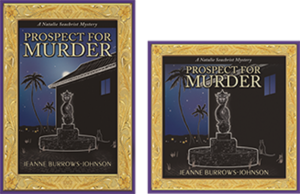
for the hardcover edition of PFM was the first design project I undertook.  After the evocative gold frame was completed, I realized it could be utilized for the entire mystery series.  And, with changes in the metallic color, it will be ideal for other book projects as well. Below is the first version of the book jacket, which was clearly too dark!

Prospect for Murder...in written and audio editions...the first Natalie Seachrist Hawaiian Mystery

ORIGINAL 9-CD AUDIO BOOK ALBUMS
After I completed recording the 9-CD audio book, it was time to modify the book jacket art.  For the CD albums, my job was to shorten text describing the book and me, as well as the snippets of reviews.  My artist and typographer Yasamine June [you can view samples of her work at www.yasaminejune.com] then adjusted the size and proportion of her original artwork and dropped in my edits.

EBOOK AND AUDIO EDITIONS
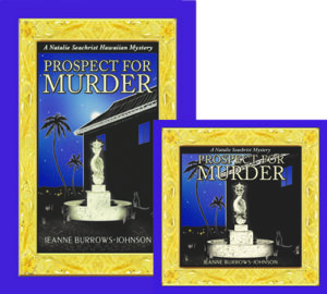
The next task was designing website icons for sites offering the downloadable audio and eBook editions.  Our goal was to enhance a visitor’s recognition of the products being offered.  Therefore we created a conjoined image of the hardcover book jacket and a square edit resembling a CD case.  Wherever possible, this paired image is used to signify that Prospect For Murder is available in multiple formats.

I should mention that during this process, I realized that the original art image was too dark. Consequently, I had Yasamine brighten the cover, especially the dragon fountain. Subsequent to these changes, I was thrilled when Prospect for Murder won cover art design in the New Mexico-Arizona Book Awards in 2017.

DESIGNING PROMO MARTERIALS & YOUR WEBSITE

The art of communication is one of the most vital skills a professional in any field can develop to help them in achieving goals and objectives in both their public and private living.  The following tools can be refined to maximize messages to colleagues, friends and the general public.

ARTWORK
I use the iconic paired image of the print and audio editions of PFM as artwork for both printed promotional materials and my author website.  Without intention, the colors for Prospect For Murder and Imaginings Wordpower were nearly the same, which has greatly simplified my choice in color palette. I am still contemplating where and how I will utilize the gold frame.

TITLING
I have used the Peignot font for my promotional business, Imaginings Wordpower [www.ImaginingsWordpower.com] for many years.  Therefore, I chose to use it for the titling of book jackets, my author website, and all promotional materials for the Natalie Seachrist series.  This decision is especially appropriate since many of the historical details used in the series predate World War II.  The Peignot font is an art déco [or style moderne dating from the 1920s], sans-serif display typeface designed by A. M. Cassandre in 1937 for the Deberny & Peignot Foundry in France.  While this font is too stylized for lengthy text, it makes a viable statement for titling and headings.

BUSINESS CARDS
Unexpectedly, I discovered that the standard size of a business card and the dark haunting color of the hardcover and audio book art was not suitable to my new double-sided author business card.  To resolve these problems, I created a new image.  I did this by overlapping the frame of the hardcover edition with that of the downloadable audio edition.   In the lower right-hand corner, I inserted the gold hibiscus found in the corners of the frames.  This has proven effective, since the image is always accompanied by text providing my name and the title of the book.

STATIONERY & FORMS
With use of the paired image of the print and audio books, plus the Peignot font, there were few decisions to make in creating my author letterhead stationery.  For most purposes, I place the iconic art image in the top left hand corner of the page and all contact information centered at the bottom.  This layout works for both letters and business forms [such as invoices]. 

LOGO NOTECARDS
For many years I’ve used what I call logo notecards to extend invitations, express gratitude, and confirm appointments.  For both portrait and landscape layouts, I place a logo in one quadrant of an 8.5 x 11 inch layout, with text positioned diagonally and upside down from the artwork.  The printed result is a sheet of paper that can be folded into a 5.5 x 4.5 notecard that will fit an invitation-sized envelope. 

POSTCARDS
After discovering that postage was the same for a couple of sizes of postcards, I chose a dimension of 8.5 x 5 inches for my author’s promotional postcard.  Beyond displaying recognizable book cover art, this ensures sufficient space for a synopsis and book reviews, plus purchasing options.  The art and descriptive text pop against a simple white background, with a high gloss finish on the front side for durability and flat finish on the back, which facilitates use of a pen for personal messages. 

Sadly, I discovered a typo after receiving an initial order of the postcards.  And having continued to receive positive reviews, I realized I should have printed a small number of the cards initially, to allow for subsequent corrections and additions.  As my publisher has declined to reprint book jackets with the latest reviews, I’m glad my second run of postcards allows me to send out books as samples, or for review or sale with up-to-date information.

OTHER PROMOTIONAL CONSIDERATIONS

COMMUNICATING THROUGH EMAILS
Every piece of communication you generate is a marketing opportunity.  And while you may not use an outgoing email layout paralleling your letterhead stationery, you can strategically position artwork, logos, and other information to draw the recipient’s eye.  I put the paired book image and purchasing information in the top left-hand corner of each outgoing email.  For the signature section for all outgoing emails, I have added a link to my author website [JeanneBurrows-Johnson.com],   my Imaginings Wordpower website [ImaginingsWordpower.com], and this blog [Blog.JeanneBurrows-Johnson.com].

WEBSITES DISPLAYING NEWLY RELEASED BOOKS
As the release date for PFM neared, the number of websites featuring the book increased.  Unfortunately, some had received galleys displaying artwork devised as a placeholder for the book jacket art that was to come.  Without proper notification, these sites would continue to display the galley image as being representative of the published book.  Therefore, I suggest that authors releasing books through publishers or on their own, remain vigilant in cruising the Internet to ensure that the words and images describing them, as well as their work appear as they intend!

In addition, authors need to be aware that many popular websites selling and promoting books do NOT offer an easy means for having books reviewed or even displayed in categorical listings.  Most of the time, an author’s work is only visible if the visitor to a site knows the author’s name or book title.  I strive to see Prospect For Murder displayed under the following categories for each of its several editions:  Hawai`i; Hawaiian mysteries; cozy mysteries; cat mysteries; female authors; female detectives; female sleuths. If you have any tips to help me with this situation, please drop me a note through the contact form on one of my websites…

Wishing you the best in your creative endeavors,
Jeanne Burrows-Johnson, author, consultant, and motivational speaker

Further discussion of art is available at the following blogs:
Authors Design Dilemmas 1, April 2015
Confronted by a Fantasia of Fonts, May 2015
Rainbows of Color, May 2015
Winning Logos & Slogans, October 2015
Quality Book Production, February 2016
Harmonizing Branding Elements, August 2016
Book Promotion and Evolving Art, January 2017
Balancing Text and Space, February 2018
Successful Cover Art, December 2018

To learn more about the award-winning Natalie Seachrist Hawaiian Mysteries, including Murders of Conveyance [Winner, Fiction Adventure-Drama, 2019 New Mexico-Arizona Book Awards] and other projects, please drop in at my author’s website JeanneBurrows-Johnson.com. You’ll even find Island Recipes that might inspire your culinary creativity.

For more ideas to strengthen your Wordpower© and branding, please visit: Imaginings Wordpower and Design Consultation.

Follow Me:
Amazon, Arizona Authors Association, Apple Books
Audible, Authors Den, Barnes and Noble, Blogarama, Book Bub
Cozy Mysteries-Unlimited, Facebook, Good Reads, Hometown Reads

Book sellers may contact book distributors such as:
Baker & Taylor, Follett, IPG, Ingram, Mackin, Midpoint, TitleWave
WINNING LOGOS & SLOGANS…

emmas for AuthorsRich Palettes of Words & Images for Authors & Artists!

While logos and slogans are usually associated with corporations, they can facilitate communication with the public and be key branding elements for any business endeavor, regardless of size or tax status.  And, yes, that includes professional writers wishing to facilitate communication with their readers, listeners, and/or viewers.  The memorable branding messages of successful authors truly echo the rich palette of words and images used by Fortune 500 companies! 

PICTURE A SUCCESSFUL LOGO OR SLOGAN
What comes to mind when you think of a successful logo or slogan?  Perhaps the first is the iconic image of a cola company that has been in business for over one hundred and twenty-five years.  There have been many artists who have brought their own creative process to the company.  But while its logo has changed in minor ways, the bright color palette, signature font, and swirls of one type or another have remained ever present.  

In contrast, its slogans and other commercial text for their signature product have been altered periodically.   This is not surprising since marketing styles and considerable linguistic evolution have occurred within the same decades.  But with each change, the artistic vision of the company has been consistent—to provide a pleasurable sensory experience to the product’s target market.
Tips
ELEMENTS OF A SUCCESSFUL LOGO OR SLOGAN
In addition to any artistic icon,
the choice of color and fonts utilized in shaping the outward image of a viable brand must be memorable.
They must also be appropriate to the product or service, as well as the demographics of the target market.  However, since a business can select a specific slice of their market to target, the style of two businesses within a particular industry can vary considerably.

Consider snack foods intended for children.  Generally, bright, happy colors, images, and simple easy-to-read—or even cartoonish—text fonts are appealing to that market.  But when the ingredients are organic, the use of colors associated with nature is the norm.  In addition, with growing concerns for the environment, recycled and/or recyclable packaging is becoming preferable…at least to parents.

When you know the demographics of your target market, your first decision in establishing your brand may be deciding whether to use your personal or business name without an accompanying image. This may be appropriate if your name distinguishes your business from others that offer parallel products and/or services.  However, the use of an artistic design element not only clarifies what you do, but demonstrates the style in which you operate.  Thus, a black, profiled outline of a woman with luxurious hair, standing in high heels against a deep plum color may convey an ideal image for an upscale salon or spa.  If the figure of a man in a tuxedo were added, an iconic image for a ballroom dancing studio would emerge.

DYNAMIC TEXT IN LOGO DESIGN
Let’s now consider how we might design a logo for a company we’ll call Inner City Painting.  Beyond the simple use of text, one could
use an upturned paint brush with a splash of paint for each of the i’s in the text.  At the next level of complexity, a simple line drawing of a home or a string of commercial buildings could declare the firm’s niche market. 

Aside from clean, non-seraphed text, three primary colors might convey a no-frills provider of basic painting services.  Conversely, sweeping art strokes, an elegant font, and an exotic color palette would suggest a more artistic enterprise.  [See DESIGN DILEMMAS FOR AUTHORS, Part 3:  COLOR, May 30, 2015, regarding the use of standardized colors to ensure uniform coloration in both print and electronic publishing.]

Several years ago, I was working with a local printer whose family had been in the industry in a large city for several decades.  Although the familial entity no longer existed, the branding artwork remained.  It depicted a happy cartoon character inviting the public through their doors.  The style of the figure, his attire and shoes all pointed to another era, but the idea of a friendly chap greeting customers was still a viable concept—especially in this age of impersonal mega-corporations.  With the help of a graphic artist, the image of your friendly neighborhood printer was updated and served to introduce the firm to a new generation of clients seeking full-service printing design and production.

THE IMPORTANCE OF LOGOS IN BRANDING
Equally important to an effective branding program is the choice of a slogan
, for both individuals and organizations.  Notice that I am using the single noun, S L O G A N.  Too often I find promotional decision makers attracted to complex images and multiple descriptive phrases.  This simply muddies the waters and presents a jumbled NON-MEMORABLE image to the public.

Consider artist John Smith.  He might present himself as:  John James Smith, portraitist.  In this case, his middle name separates the artist from other men named John Smith and the word portraitist specifies his specialty.  Additional, qualifying words and phrases can offer further information that will attract appropriate clients to him.  The following is a simple representation of Mr. Smith and his classic painting:

Portraits in Oil Offered by
John James Smith, M.F.A.

Another issue to consider in textual aspects of branding is punctuation.  Instead of shifting font or using italics, some promotional decision makers complicate a design by ending slogans with punctuation.   I suggest saving punctuation for actual sentences and paragraphs of descriptive text.  I find that the shortest path to memorability lies in simplifying your words and design elements.  

ENSURE SIMPLICITY
Designing branding elements in popular dimensions you are most likely to see in print ensures simplicity and that means ease in utilization in multiple projects. 
That means that although your graphic artist may be thrilled to present you with an 8.5 x 11 inch design, have them offer you samples in the sizes of dimes, nickels, quarters and silver dollars.  When you do this, you will quickly see that extraneous strokes and other details are lost in such dimensions and can even prove distracting to the message you are trying to convey with a business card or advertisement.  The size of fonts used for your name and any slogan will naturally have to be proportional to the size of the icon being presented.

With the publication of Prospect For Murder, the first Natalie Seachrist Hawaiian Mystery set in Honolulu, I have been sorting through old files.  In examining the progression of my own branding, I see that for over a decade, I simply used my name and a few bulleted words to describe my work.  In 1995, I launched use of the word Imaginings in my business name while completing edits for an article I co-authored for Broker World Magazine.  Since I was moving from Honolulu to Tucson, it was part of an authoring strategy for introducing myself to a new locale for my physical business, as well as potential regional, national or even international audiences.  [You might find it interesting to note that at that time I was sometimes told that there was no such word as imaginings.]

Through the years, I have offered clients several products and services to enhance their physical environs, as well as their promotional representations.  While previously using merely a textual presentation of myself, a couple of years ago I decided to design an iconic image that would represent several elements of my careerCommercial writing, design consultation, and floral art.  I knew that utilizing a pen would clearly represent the largest area of my work.  As I sometimes provided faux painting of accent walls to commercial clients, it seemed natural to also include an artist’s brush.  Finally, as I have offered floral designs to both friends and clients, some form of floral image was indicated. 

My logo has evolved over time is used in myriad ways.  Some variations have been necessitated by hardcopy printing vs. electronic presentations:  Boldness and detail; portrait and landscape formats; framed and unframed; isolated or with text.  Despite these differences, the use of gold, blue and plum colors have been consistent–except when a solid gold background is required. I’m glad to say that my icon is becoming recognized…

With my writing shifting from commercial writing to fiction, my personal name may become more recognizable.  Nevertheless, I like the elements of this image that sums up my work to date.  However, I think it’s time for the hand of a graphics professional to finalize my signature icon, so that I can empower my image as well as my words as an author.

Wishing you the best in your creative endeavors,
Jeanne Burrows-Johnson, author, consultant, and motivational speaker

Discussion of art is available at the following blog posts:
Authors Design Dilemmas 1, April 2015
Confronted by a Fantasia of Fonts, May 2015
Rainbows of Color, May 2015
Winning Logos & Slogans, October 2015
Quality Book Production, February 2016
Harmonizing Branding Elements, August 2016
Book Promotion and Evolving Art, January 2017
Balancing Text and Space, February 2018
Successful Cover Art, December 2018

To learn more about the award-winning Natalie Seachrist Hawaiian Mysteries, including Murders of Conveyance [Winner, Fiction Adventure-Drama, 2019 New Mexico-Arizona Book Awards] and other projects, please drop in at my author’s website JeanneBurrows-Johnson.com. You’ll even find Island Recipes that might inspire your culinary creativity.

For more ideas to strengthen your Wordpower© and branding, please visit: Imaginings Wordpower and Design Consultation.

Follow Me On:
Amazon, Arizona Authors Association, Apple Books,
Audible, Authors Den, Barnes and Noble, Blogarama, Book Bub,
Cozy Mysteries-Unlimited, Facebook, Good Reads, Hometown Reads

Book sellers may contact book distributors such as:
Baker & Taylor, Follett, IPG, Ingram, Mackin, Midpoint, TitleWave
ENERGIZING NARRATIVE PASSAGES

Is your pen always at the ready?Are you an effective teller of tales?

Professional or amateur, the most challenging part of a day of wordsmithing may be facing a blank piece of paper, or an empty page on your monitor’s screenespecially if you’re writing what feels like a dull narrative.
Writing Tips
THE ART AND SCIENCE OF WRITING
It may be surprising to you, but despite our electronic age, there are still writers who begin each project with hardcopy composition.  If this authoring strategy produces effective prose, it’s hard to argue with their writing process.  It’s all a question of the results that come from one’s practice of the art of communication.  In both fiction and non-fiction, when the writer’s inspiration produces a rich palette of words that maximizes their reader’s experience, their methods have been successful!

Regardless of your wordsmithing process, on days when you feel lacking in creativity and even editorial direction, I suggest you begin by capturing the images that first come to your mind as you contemplate the scope and goals of your project.  Work without concern for the structure of language, correct grammar, or the sequence in which the words emerge.  Within a short while, you should find yourself producing an unstoppable stream of verbiage. 

As your pace slows, you can pause to write a brief outline of your work to that point.  Confident that you will not lose direction, glance over your creative output for patterns within the images, dialogue, and activity that you have produced.  You can then begin empowering your words by strengthening the connectivity of fragmented text.

You should then be able to move back and forth between the creative and editorial processes fairly easily.  I stress the first category—creativity—because writers often lose images they have glimpsed by becoming too absorbed in initial self-editing.  Remember, editing can always be accomplished at a future time.  But if you lose your inspired thoughts, they may never be retrieved…or built upon as you initially envisioned.

Experienced authors often have an established writer’s voice on which they can draw.  This is true whether they are writing the fourth book in a series, or constructing a non-fiction piece reflecting their true voice and personality.  Whether you are in this position, or creating a wholly new voice, you may wish to take a few moments and reflect on the tone, sophistication of vocabulary, structure of language that is most appropriate to the current work, and images that will enhance the sensory experience of your audience.  [Please note that I am referring to your voice as the teller of facts or a story, not the voices of any characters you may be creating.]

With these elements in mind, you can enter the realm of refining the vocabulary and organization of your piece.  As usual, I suggest you begin with the most obvious edits.  Personally, I have a tendency to employ overly complex sentence structure that begs immediate trimming.  Another pattern that many of us face is the need to flip first and last clauses, sentences, and even paragraphs.  Like everything else, practice makes better, if not perfect, form.  By the time you’ve reached the end of a couple of sections, your structure should have tightened with increasing clarity.
Writer’s Guidelines
MY EDITORIAL PROCESS
Sometimes in the midst of mundane edits, I have a sense of the truly impactful changes I wish to make.  If working in hardcopy (often late at night in the midst of classic films or predictable episodes of television mystery shows), I’ll make marginal notes regarding a character’s appearance, vocabulary, motivations, or inner thoughts regarding other characters.  [This has proven especially important when working on books subsequent to Prospect for Murder in the continuing Natalie Seachrist Hawaiian Mystery series.] And when at the computer, I may utilize small sticky notes to record my ideas.

With obvious adjustments to structure complete, I move within the piece to maximize its overall flow and tone.  I usually begin by modifying nouns and adjectives.  In a previous blog on color theory [see Design Dilemmas for Authors, Part 3:  Color, May 30, 2015], I discussed various words that might be used in place of the word blue to enhance your color palette

FACILITATING COMMUNICATION
Likewise, consider how you might embellish a scene referring to a red sofa.  While inappropriate for a children’s picture book (and most contemporary fiction), the author of a dramatic historical novel might say, “The heroine entered the study nervously and perched on the garnet colored velvet chaise lounge.”  Here I wish the reader to feel wooed by the distinctive color, texture and shape of a piece of furniture. 

In my own writing, I frequently draw on the breadth of my writer’s palette to concisely depict the ambiance of a scene.  For example, “She heard the sharp sound of a gunshot” became “She was startled by the sharp report of a bullet slicing the air.”  Here I turned a matter-of-fact incident report to a description of my character’s response, which allows the reader to join in the heroine’s frightening experience which will enable your reader to feel they are present at the scene…and who knows how that may prove useful if your piece were to be converted to a script for a movie or television show.
Impactful Advertising Messages
ALTERING PUNCTUATION
Consider the following examples of shifting vocabulary, word sequence, and punctuation that can alter a reader’s interpretation of a passage within commercial as well as fictional text:

Experience the unique luxury of a journey to the Orient aboard the majestic RMS Empress of Britain.  [Advertising copy similar to posters for the ship’s 1932 world cruise]

I journeyed from Hong Kong to Honolulu aboard the RMS Empress of Britain.  [A matter of fact statement appropriate for any type of writing]

Truly…I did enjoy my trip aboard the RMS Empress of Britain.  [A plea to be believed; perhaps for the dénouement of a murder mystery]

I immensely enjoyed my sojourn from Hong Kong to Honolulu aboard the luxurious RMS Empress of Britain.  [An elegant, almost fussy statement, appropriate to a romance novel]

There are many ways to strengthen your writer’s voice for each project you undertake.  Reading other works in the same genre by authors you like and dislike will provide examples to emulate, as well as to reject in your own work.  There are also reference materials that will broaden your ability to describe people and occurrences in an articulate manner appropriate to your genre.  You might begin by perusing your own reference library to ensure you have:  A couple of grammar-cramming style books such as The Chicago Manual of Style and the Associated Press Stylebook, which are standards.  You will also want to have a thesaurus or two, and a few dictionaries, including ones for foreign words or phrases you might use. 

A RICH PALETTE OF IMAGES
Beyond these basics, consider how you can use Internet search engines and other materials.  One of the most interesting sources I’ve found is obituaries [see Shopping for Characters, May 12, 2015].  This is a great place to find physical descriptions of people, and to discover comprehensive biographic images and sometimes even the settings through which men and women of past generations walked.

Wishing you the best in your creative endeavors,
Jeanne Burrows-Johnson, author, consultant, and motivational speaker

Tips to enhancing your writing may be found in the following posts:
Empowering Your Words, February 2015
Creating Fictional Characters, March 2015
Sidestepping Writer’s Block, April 2015
Communicating with Every Sense, May 2015
Energizing Narrative Passages, September 2015
The Author Recycles, July 2017
Balancing Text & Space, February 2017
Book Series Adventures, April 2018
Drawing on Sense Memories, July 2018

To learn more about the award-winning Natalie Seachrist Hawaiian Mysteries, including Murders of Conveyance [Winner, Fiction Adventure-Drama, 2019 New Mexico-Arizona Book Awards] and other projects, please drop in at my author’s website JeanneBurrows-Johnson.com. You’ll even find Island Recipes that might inspire your culinary creativity.

For more ideas to strengthen your Wordpower© and branding, please visit: Imaginings Wordpower and Design Consultation.

Follow Me On:
Amazon, Arizona Authors Association, Apple Books,
Audible, Authors Den, Barnes and Noble, Blogarama, Book Bub,
Cozy Mysteries-Unlimited, Facebook, Good Reads, Hometown Reads

Book sellers may contact book distributors such as:
Baker & Taylor, Follett, IPG, Ingram, Mackin, Midpoint, TitleWave
Author Design Dilemmas 3, Color


What visions dance in your dreams?An Author’s Inspiring Rainbows of Color

How many colors are in the rainbows you paint? There are many perspectives on the use of color in the art and science of writing.  But even if I were an expert, this short space wouldn’t allow a comprehensive discussion of color theory [the traditional theory for mixing three primary colors to derive all other colors] or colorimetry [analysis of human color perception]. 

Variables in Color PerceptionMost people can see three distinct ranges of color.  Due to genetics, some women [called tetrachromats] are able to see four ranges of color.   Sometimes a temporary inability to see some or all color is caused by illness, allergies, medication, or hormone replacement therapy.  Even sufferers of Post-Traumatic Stress Disorder [PTSD] may notice a decrease in perception of color.  And, did you know that one out of twelve men and one out of two hundred women have color vision deficiencies? 

Choosing Color Palettes For Artwork to Accompany Text.   As discussed in my blog on engaging a reader’s senses, I believe that analysis of one’s genre provides the answer to many publishing questions and can help solidify authoring strategies.  Empowering your words as an author can take many forms.  One author I know brings a minimalist approach to her creative process in selecting art for a children’s book.  She believes that faint sketches without full form, shape, or color will encourage children listening to or reading her prose to bring images from their own minds to their reading experienceThis minimalist approach may be ideal for poetry and historical fiction.  However, it would be at odds with the hard-nosed writer’s voice usually employed in a police procedural and would lack clarity for many non-fiction projects.
Art and Science of Writing
While minimalism is a specific art movement, the term may be used generically to describe the overall expression of modern art in the late nineteenth and twentieth centuries.  Beyond an escape from classic realism, modern art focuses on the artist’s desire to interact with the minds and life experiences of his or her audience members.

Consider More Than Personal Preferences When Selecting Color.  If you are new to wordsmithing, you may not be thinking about branding But you might want to consider establishing the foundations of the brand for which your writing will be noted someday.  And just as an effective editorial process dictates that writers carefully select modifiers to create a scene rich in sensory images, a distinctive color palette can be one element in a design aesthetic that harmonizes with and even intensifies the impact of text.
Writers’ Guidelines
Beyond technical research you conduct regarding coloration, there are several issues to consider.  Does the style of your writing reflect your taste in art?  Do you like the detail of classism or the sharp clean lines of modern art?  Are you drawn to bright primary colors or muted subtle tones?  Do the peach and aqua tones of a sunset in the Southwest reflect your taste and your work? 

Regional Coloration Differences in regional color can be indicated by the dialect[s] of your characters, as well as the scenes you describe.  Growing up in Oregon, I was accustomed to the dark green of Douglas fir trees and the mosses that grow on them.  The palm trees in Hawai`i are pale in comparison.  In Arizona the array of green is mixed, depending on topography, season, and the amount of rainfall.  So which green would be most appropriate to your project?

The Juncture Of Style And Color.   In children’s books, hard-edged cartoon-like solid color images (like those a child might create) may be ideal.  But regardless of the style of art you select, the bright saturated colors associated with modern art are popular with and stimulating for young children.  Conversely, the sometimes dark tones of animè lend a sophisticated note to projects for both adults and older children.  For most genres, classic realism is appropriate.  To present images realistically, considerable detail and subtleties of color are usually required.

Articulating Your Artistic Vision is vital.  Since it is unlikely that you will be the artist shaping the images that will highlight your writing, you must be able to describe your desires to whoever is in charge of publication.  I suggest writing a paragraph outlining the specific elements you are seeking.  As with a journalistic endeavor, an inverted pyramid structure is useful.  Begin with an overview of the style you desire and then move on to specific issues like color.  If possible, use technical terms an artist or printer will understand.  For instance, consider specifying the tones and shades of colors you prefer. 

When viewed under varied lighting, a color’s tone [intensity of color] or shade [how bright a color is] will be perceived differently. Personally, I have found it challenging to use what I have termed a plum color in artwork for Prospect For Murder [the first book in the Natalie Seachrist Hawaiian Mystery series].  While my artist Yasamine June [view her work at www.yasaminejune.com] generated a wonderful color for the book jacket, subsequent applications for the audio book and some promotional materials have deviated from the color and/or tones she utilized.

Samples Of Your Preferred Palette and style will greatly aid the person executing your artistic vision.  These can be drawn from many sources:  websites; books and other printed material; fabric and clothing; pieces of art.  Consider offering the images of famous paintings.  Simply naming a type of art or an easily referenced artist will communicate your wishes.  Personally, I am drawn to the delicate images of classical Asian paintings, as well as the neo-classism of Maxfield Parish who was known for his use of saturated colorUnfortunately, since his work ended mid-twentieth century, a young artist may be wholly unaware of his work.

You can also provide numerical descriptions of colors.  Paint Stores offer samples of colors, with numerical coding as well as alphabetical names.  Printers can provide numbers for the Pantone® colors of ink used in most hardcopy printing.  And remember that you do not have to access a graphic art program to provide the color model numeration of computer font colors.  Simply mark a section of text within a word processing program and examine the ranges of colors available under the drop-down arrow for font color.

I should caution you that identifying a color is no guarantee of how a printed product will arrive at your doorstep.  Have you ever seen two editions of the same book, printed by the same company following the same instructions?  Even in hardcopy printing, variations in color can occur because of differences in batches of ink or toner, the moisture content of the paper used, and production executed on innumerable types and conditions of equipment.

A final consideration in our discussion of color printing is publication via downloading from the Internet.  If this is how your work will be published, you should consider using colors designated as “web safe.”  Again, there will be varied results in what is viewed by your readers.  If nothing else, variations in monitor settings can prevent uniformity in how myriad viewers will experience a color on your website or in your book. 

Before we leave the topic of color, let’s consider the historical and classical interpretations of color.  Some colors, like the royal purple from Tyre, Lebanon, were originally drawn from rare and precious sources.  To produce even small amounts of the Tyrian colorant, thousands of Mediterranean Sea mollusks [scientific name, murex brandaris] were needed for the dyes with which luxurious garments for ancient royals were fashioned.  Another historically rare color was the crimson worn by Roman legionnaires and wealthy matrons.  Traditionally associated with power and wealth, this color was obtained from the kermes vermilio planchon, an insect that grows on the kermes oak tree [quercus coccifera] of southern Europe.  Although the means for obtaining and utilizing dyes and paints have changed dramatically through history, their inner meanings have remained linked to aspects of nature.

Yellow and Orange – Associated with the sun and gold, these happy and bright colors are used for many attention-getting purposes.  Depending on their tone, they may be linked to base and deeply discounted items, or conversely, to the richest and most valued products.

Red – Traditionally linked to sunsets, fire, blood, Mars the planet and Mars the Roman god of war.  Red is now often associated with signature holidays like New Year’s, Christmas, and St. Valentine’s Day and certain nations like China.   This vibrant color calls attention to anything depicted in it.  It is sometimes associated with licentiousness and the concept of Satan.

Purple – Blending blue and red, this rich color is remains linked to the concepts and value of royalty, power and wealth.

Blue – In its deepest shades, blue speaks of clear waters and skies.  In many religious expressions, it is associated with holiness and purity.  This color is often utilized by financial and insurance institutions, as well as myriad industries dealing with healthcare that wish to be considered honest and dedicated to be well-being of their clients.

Green – Representative of health in nature, it is often used for health and environmental topics, products, and services.

White –  Reflects light and embodies the presence of all colors of light.  While many substances in nature are white, animals having pure white fur are rare, and therefore their pelts were historically associated with the power and wealth of royalty.  Once difficult to achieve in pure form, white colored clothing was often valuable regardless of the type of fabric.  The color is historically linked to purity, cleanliness, goodness, and perfection. 

Black – Absorbing all colors of light, it is actually the absence of color.  Obtained by the mixing of all primary colors, black is sometimes associated with darkness and evil in historical religious written materials.  It is an excellent background for both vibrant and subtle colors.

Wishing you the best in your creative endeavors,
Jeanne Burrows-Johnson, author, consultant, and motivational speaker

For examples of sample color palettes, please also visit:  https://www.ImaginingsWordpower.com/color/plays_on_color.html

Additional discussion of the nature of color is provided at: https://www.imaginingswordpower.com/wearing/wearing_your_brand.html.

Discussion of art is available at the following blogs:
Authors Design Dilemmas 1, April 2015
Confronted by a Fantasia of Fonts, May 2015
Rainbows of Color, May 2015
Winning Logos & Slogans, October 2015
Quality Book Production, February 2016
Harmonizing Branding Elements, August 2016
Book Promotion and Evolving Art, January 2017
Balancing Text and Space, February 2018
Successful Cover Art, December 2018

To learn more about the award-winning Natalie Seachrist Hawaiian Mysteries, including Murders of Conveyance [Winner, Fiction Adventure-Drama, 2019 New Mexico-Arizona Book Awards] and other projects, please drop in at my author’s website JeanneBurrows-Johnson.com. You’ll even find Island Recipes that might inspire your culinary creativity.

For more ideas to strengthen your Wordpower© and branding, please visit: Imaginings Wordpower and Design Consultation.

Follow Me On:
Amazon, Arizona Authors Association, Apple Books,
Audible, Authors Den, Barnes and Noble, Blogarama, Book Bub,
Cozy Mysteries-Unlimited, Facebook, Good Reads, Hometown Reads

Book sellers may contact book distributors such as:
Baker & Taylor, Follett, IPG, Ingram, Mackin, Midpoint, TitleWave