DYNAMIC AUTHOR PORTRAITS

Jeanne Burrows-Johnson

ENGAGING AUTHOR IMAGES

This year has taken wholly unexpected turns for everyone in our world. For too many, this has greatly impacted professional as well as personal well-being. Despite challenges to health, commerce, and public safety, I believe this period of global transition may prove productive for creative individuals and organizations. The following is the first of several suggestions for maximizing this unsought opportunity for enhancing our daily living ,as well as our event planning.

MAXIMIZING OUR RE-EMERGENCE
Let’s begin today’s conversation by considering how the global environment has benefited from the absence of traffic on the road and the re-modelling of some segments of manufacturing. None of us can predict how this may influence decisions that global leaders will make, but we can endeavor to see that our own work reflects progress on many fronts. Like a butterfly emerging from a caterpillar’s cocoon, each of us can come out from this challenging period of global blight with a re-orientation of our lives. From our personal appearance to that of the products and services we offer our multi-cultural world, we can magnify a new dynamism that will benefit more than our individual avenues of activity.

THE AUTHOR’S VISUAL PRESENTATION
Regardless of changes that may occur in the evolving retail marketplace, it’s likely that my books will continue to be sold—at least via the Internet. Fortunately, this ensures the longevity of my visibility. Therefore, it behooves me to ensure that the images I project reflect my inner self, which I have endeavored to embed in my writing. Most of us have heard the adage that an author or artist, should create works that reflect personal knowledge and experience. I have always strived to do this despite a narrowing path of the latter days of my life. Hopefully, the breadth of my creations will continue to demonstrate both my personal and professional growth.

DYNAMIC IMAGES FOR AUTHORS
There are many ways in which our images are utilized for branding and promotion. These can include business cards and brochures, websites, blogs, and interviews with the media, as well as the book jackets and bookmarks used by those of us who are authors. Sometimes pictures taken during events offer an active view of projects in which we are currently or previously involved. But given the casualness with which such pictures are taken, it is often more effective to use studio produced images that can be shaped and re-shaped to ensure the impact one desires for multiple purposes.

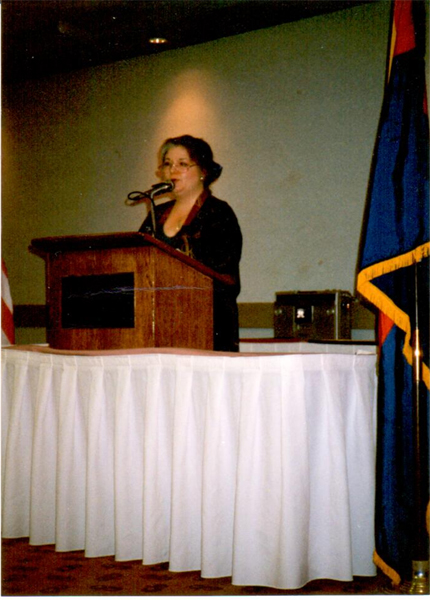
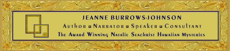
IMAGES FROM THE PAST
The first photo in the above pair was taken during a public speaking event at a service club’s meeting. As you can see, there are extraneous items surrounding me. So while this picture is ideal for discussing the purpose and content of that particular talk, utilization of this picture for other purposes required the adjustments that I made in the edit.

MY AUTHOR PORTRAIT
As noted in my blog of March 2020, I initially viewed this year as an ideal time to introduce a fresh look in my marketing materials. In contrast, since my personal appearance has not changed greatly, I chose to retain the professional photograph shot during the publication of Prospect for Murder. A few refinements were required to render that image effective. You see, my preferred photos were taken at the end of the shoot in a space whose air was treated by evaporative cooling rather than air conditioning. The result was that my hair was somewhat flat. Fortunately, I have a friend who copied, pasted, and tweaked my hair.

Other aspects of arranging my portrait included an elegant jacket and necklace, books to my side and a colorful Asian fabric as a backdrop. These choices combine to project an intriguing representation of the trio of Natalie Seachrist Hawaiian Mysteries which feature many pan-Pacific components. The one new element in my self-introduction is presenting my picture in a circle…I wonder if I could substitute the spines of my own books for the classic volumes beside me?

In considering images you will want to use, remember that your goal is to acquire a rich palette of images of yourself and your work. To achieve this, I suggest that you examine the many individual and group photos you may have already–in both hardcopy and electronic files. Even those from your youth may prove useful in discussing your personal and/or professional journey through life. And for each one, be prepared to shape multiple images that will prove effective for varying purposes.

FYI CAROL BLONDER, the lively host of NETWORKING ARIZONA interviewed me earlier this year. CLICK BELOW to catch the podcast. To learn more about Carol’s continuing connections with Arizona business professionals, visit her website https://networkingarizona.net/.

Wishing you the best in your creative endeavors,
Jeanne Burrows-Johnson, author, consultant, and motivational speaker

Another blog you may find of use for promoting creative projects is at https://blog.jeanneburrows-johnson.com/2017/01/book-promotion-and-evolving-art/

To learn more about the award-winning Natalie Seachrist Hawaiian Mysteries, including Murders of Conveyance [Winner, Fiction Adventure-Drama, 2019 New Mexico-Arizona Book Awards] and other projects, please drop in at my author’s website JeanneBurrows-Johnson.com. You’ll even find Island Recipes that might inspire your culinary creativity.

For more ideas to strengthen your Wordpower© and branding, please visit: Imaginings Wordpower and Design Consultation.

Follow Me:
Amazon, Arizona Authors Association, Apple Books
Audible, Authors Den, Barnes and Noble, Blogarama, Book Bub
Cozy Mysteries-Unlimited, Facebook, Good Reads, Hometown Reads

Book sellers may contact book distributors such as:
Baker & Taylor, Follett, IPG, Ingram, Mackin, Midpoint, TitleWave


WINNING LOGOS & SLOGANS…

emmas for AuthorsRich Palettes of Words & Images for Authors & Artists!

While logos and slogans are usually associated with corporations, they can facilitate communication with the public and be key branding elements for any business endeavor, regardless of size or tax status.  And, yes, that includes professional writers wishing to facilitate communication with their readers, listeners, and/or viewers.  The memorable branding messages of successful authors truly echo the rich palette of words and images used by Fortune 500 companies! 

PICTURE A SUCCESSFUL LOGO OR SLOGAN
What comes to mind when you think of a successful logo or slogan?  Perhaps the first is the iconic image of a cola company that has been in business for over one hundred and twenty-five years.  There have been many artists who have brought their own creative process to the company.  But while its logo has changed in minor ways, the bright color palette, signature font, and swirls of one type or another have remained ever present.  

In contrast, its slogans and other commercial text for their signature product have been altered periodically.   This is not surprising since marketing styles and considerable linguistic evolution have occurred within the same decades.  But with each change, the artistic vision of the company has been consistent—to provide a pleasurable sensory experience to the product’s target market.
Tips
ELEMENTS OF A SUCCESSFUL LOGO OR SLOGAN
In addition to any artistic icon,
the choice of color and fonts utilized in shaping the outward image of a viable brand must be memorable.
They must also be appropriate to the product or service, as well as the demographics of the target market.  However, since a business can select a specific slice of their market to target, the style of two businesses within a particular industry can vary considerably.

Consider snack foods intended for children.  Generally, bright, happy colors, images, and simple easy-to-read—or even cartoonish—text fonts are appealing to that market.  But when the ingredients are organic, the use of colors associated with nature is the norm.  In addition, with growing concerns for the environment, recycled and/or recyclable packaging is becoming preferable…at least to parents.

When you know the demographics of your target market, your first decision in establishing your brand may be deciding whether to use your personal or business name without an accompanying image. This may be appropriate if your name distinguishes your business from others that offer parallel products and/or services.  However, the use of an artistic design element not only clarifies what you do, but demonstrates the style in which you operate.  Thus, a black, profiled outline of a woman with luxurious hair, standing in high heels against a deep plum color may convey an ideal image for an upscale salon or spa.  If the figure of a man in a tuxedo were added, an iconic image for a ballroom dancing studio would emerge.

DYNAMIC TEXT IN LOGO DESIGN
Let’s now consider how we might design a logo for a company we’ll call Inner City Painting.  Beyond the simple use of text, one could
use an upturned paint brush with a splash of paint for each of the i’s in the text.  At the next level of complexity, a simple line drawing of a home or a string of commercial buildings could declare the firm’s niche market. 

Aside from clean, non-seraphed text, three primary colors might convey a no-frills provider of basic painting services.  Conversely, sweeping art strokes, an elegant font, and an exotic color palette would suggest a more artistic enterprise.  [See DESIGN DILEMMAS FOR AUTHORS, Part 3:  COLOR, May 30, 2015, regarding the use of standardized colors to ensure uniform coloration in both print and electronic publishing.]

Several years ago, I was working with a local printer whose family had been in the industry in a large city for several decades.  Although the familial entity no longer existed, the branding artwork remained.  It depicted a happy cartoon character inviting the public through their doors.  The style of the figure, his attire and shoes all pointed to another era, but the idea of a friendly chap greeting customers was still a viable concept—especially in this age of impersonal mega-corporations.  With the help of a graphic artist, the image of your friendly neighborhood printer was updated and served to introduce the firm to a new generation of clients seeking full-service printing design and production.

THE IMPORTANCE OF LOGOS IN BRANDING
Equally important to an effective branding program is the choice of a slogan
, for both individuals and organizations.  Notice that I am using the single noun, S L O G A N.  Too often I find promotional decision makers attracted to complex images and multiple descriptive phrases.  This simply muddies the waters and presents a jumbled NON-MEMORABLE image to the public.

Consider artist John Smith.  He might present himself as:  John James Smith, portraitist.  In this case, his middle name separates the artist from other men named John Smith and the word portraitist specifies his specialty.  Additional, qualifying words and phrases can offer further information that will attract appropriate clients to him.  The following is a simple representation of Mr. Smith and his classic painting:

Portraits in Oil Offered by
John James Smith, M.F.A.

Another issue to consider in textual aspects of branding is punctuation.  Instead of shifting font or using italics, some promotional decision makers complicate a design by ending slogans with punctuation.   I suggest saving punctuation for actual sentences and paragraphs of descriptive text.  I find that the shortest path to memorability lies in simplifying your words and design elements.  

ENSURE SIMPLICITY
Designing branding elements in popular dimensions you are most likely to see in print ensures simplicity and that means ease in utilization in multiple projects. 
That means that although your graphic artist may be thrilled to present you with an 8.5 x 11 inch design, have them offer you samples in the sizes of dimes, nickels, quarters and silver dollars.  When you do this, you will quickly see that extraneous strokes and other details are lost in such dimensions and can even prove distracting to the message you are trying to convey with a business card or advertisement.  The size of fonts used for your name and any slogan will naturally have to be proportional to the size of the icon being presented.

With the publication of Prospect For Murder, the first Natalie Seachrist Hawaiian Mystery set in Honolulu, I have been sorting through old files.  In examining the progression of my own branding, I see that for over a decade, I simply used my name and a few bulleted words to describe my work.  In 1995, I launched use of the word Imaginings in my business name while completing edits for an article I co-authored for Broker World Magazine.  Since I was moving from Honolulu to Tucson, it was part of an authoring strategy for introducing myself to a new locale for my physical business, as well as potential regional, national or even international audiences.  [You might find it interesting to note that at that time I was sometimes told that there was no such word as imaginings.]

Through the years, I have offered clients several products and services to enhance their physical environs, as well as their promotional representations.  While previously using merely a textual presentation of myself, a couple of years ago I decided to design an iconic image that would represent several elements of my careerCommercial writing, design consultation, and floral art.  I knew that utilizing a pen would clearly represent the largest area of my work.  As I sometimes provided faux painting of accent walls to commercial clients, it seemed natural to also include an artist’s brush.  Finally, as I have offered floral designs to both friends and clients, some form of floral image was indicated. 

My logo has evolved over time is used in myriad ways.  Some variations have been necessitated by hardcopy printing vs. electronic presentations:  Boldness and detail; portrait and landscape formats; framed and unframed; isolated or with text.  Despite these differences, the use of gold, blue and plum colors have been consistent–except when a solid gold background is required. I’m glad to say that my icon is becoming recognized…

With my writing shifting from commercial writing to fiction, my personal name may become more recognizable.  Nevertheless, I like the elements of this image that sums up my work to date.  However, I think it’s time for the hand of a graphics professional to finalize my signature icon, so that I can empower my image as well as my words as an author.

Wishing you the best in your creative endeavors,
Jeanne Burrows-Johnson, author, consultant, and motivational speaker

Discussion of art is available at the following blog posts:
Authors Design Dilemmas 1, April 2015
Confronted by a Fantasia of Fonts, May 2015
Rainbows of Color, May 2015
Winning Logos & Slogans, October 2015
Quality Book Production, February 2016
Harmonizing Branding Elements, August 2016
Book Promotion and Evolving Art, January 2017
Balancing Text and Space, February 2018
Successful Cover Art, December 2018

To learn more about the award-winning Natalie Seachrist Hawaiian Mysteries, including Murders of Conveyance [Winner, Fiction Adventure-Drama, 2019 New Mexico-Arizona Book Awards] and other projects, please drop in at my author’s website JeanneBurrows-Johnson.com. You’ll even find Island Recipes that might inspire your culinary creativity.

For more ideas to strengthen your Wordpower© and branding, please visit: Imaginings Wordpower and Design Consultation.

Follow Me On:
Amazon, Arizona Authors Association, Apple Books,
Audible, Authors Den, Barnes and Noble, Blogarama, Book Bub,
Cozy Mysteries-Unlimited, Facebook, Good Reads, Hometown Reads

Book sellers may contact book distributors such as:
Baker & Taylor, Follett, IPG, Ingram, Mackin, Midpoint, TitleWave